This is a premium feature available with the Astra Pro Addon plugin. To use these Pro features, you need to have the Astra theme along with the Astra Pro Addon installed on your website.
Please refer to the following document, to begin with, Site Layout.
A website generally has the main wrapper followed by the container.
- The main wrapper consists of a header, content, sidebar, and footer — the entire website;
- And the container is the child wrapper that includes content & sidebar.
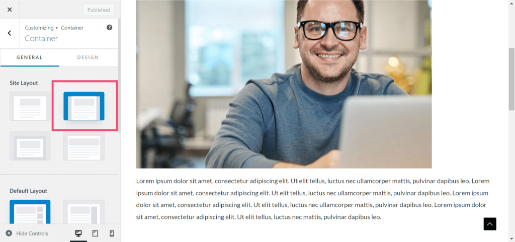
In Max Width Site Layout, the main wrapper of the website is set to a certain maximum width. We have also provided settings for you to control the top and bottom margins, so you can design your website to appear like a real box.
You can find the setting to manage Max Width Site Layout under Appearance > Customize > Global > Container > Site Layout

Other Notes:
If you need to set a background image for the entire site please check this document: Global Colors – Astra Theme.
What is the difference between Full Width Site Layout and Max Width Site Layout?
Full-Width Site Layout refers to a layout option where the content of your website spans across the entire width of the browser window, from edge to edge. This means that there are no visible margins or sidebars on the left or right side of the content area. The content takes up the full available space, allowing you to showcase your content in a wider format. It provides a more immersive and modern look, especially on larger screens.
On the other hand, Max Width Site Layout refers to a layout option where the content of your website is constrained to a specific maximum width, regardless of the width of the browser window. This means that there will be visible margins or sidebars on the left and right side of the content area, creating a more contained and focused appearance. The content is centered within the specified maximum width, providing a more traditional and conservative design.
The choice between these two layout options depends on your website’s goals and aesthetics. Full-Width Site Layouts are often used for websites that want to make a bold statement or showcase visual elements with more impact. They work well for portfolios, photography websites, or sites that prioritize a visually immersive experience. On the other hand, Max Width Site Layouts are commonly used for content-focused websites, blogs, or sites that aim for a more structured and organized presentation.